
If your author website isn’t optimized for mobile, you’re quietly losing readers and sales without even realizing it.
That’s because today, mobile devices aren’t just one way people browse the internet—it’s the primary way. From discovering new authors on social media to buying books in a matter of taps, your audience is first and foremost interacting with your brand on their phones.
That means your website needs to look great, load quickly, and function seamlessly on even the smallest of screens. So let’s break down exactly why mobile optimization matters so much, and how to get it right.
Readers Discover You on Mobile First
How do you most typically discover new things on the internet these days? If you give it even a little due thought, your answer is probably, “On my phone.” Which means your readers are doing the same thing.
Most typically, readers find new books by:
- Scrolling Instagram, TikTok, Facebook, or other social media
- Clicking links in bios or on posts
- Navigating through from ads or email newsletters
And while some of these are of course achieved on a computer or tablet, most of these actions happen primarily on mobile devices. So if a potential reader clicks through to your site and lands on a page that loads slowly, has unreadable text, or requires awkward zooming and scrolling, they’re likely going to leave within seconds.
Why does this matter? Because:
- First impressions happen instantly
- A poor mobile experience creates friction
- Friction kills curiosity (and conversions!)
While your website should be uniquely branded to your author business, it should still feel like a natural extension of the platforms readers come from, not a jarring shift to something unusable or unenjoyable.
Book Buyers Shop on Their Phones
Good mobile optimization isn’t just about aesthetics—it directly impacts your ability to sell books, if you’re selling them direct to readers through your website. (Want to learn more about selling books direct? Check out The Ultimate Guide to Direct Sales for Authors)
Readers today are very comfortable with making purchases on their phones in all formats, from eBooks to print editions to special bundles or other merchandise. So if your direct sales store isn’t mobile-friendly, you risk losing sales. All the hard work you’ve put into getting people to your website and store is wasted.
Here are some common mobile store issues to avoid:
- Buttons that are too small or hard to tap
- Images and text that don’t scale properly
- Slow-loading product pages
- Checkout forms that are tedious to fill out
Instead, a good mobile store makes sure to:
- Keep navigation simple
- Use large, easily-tappable buttons
- Load quickly even on slower connections
- Streamline the checkout process (fewer taps means more conversions)
A smooth mobile shopping experience can be the difference between an exciting impulse purchase and a frustratingly abandoned cart.
Mobile Optimization Affects SEO
Search engines like Google prioritize mobile-friendly websites when ranking search results. This is called “mobile-first indexing,” and what it means is that Google will primarily use the mobile version of your site (rather than the desktop version) to determine search rankings.
So if your site isn’t mobile optimized:
- Your ranking may drop (hurting discoverability)
- Your pages may load slower (affecting overall SEO performance)
- Users may leave more quickly (detracting from overall activity data)
If your site is optimized, however, then you get:
- Better visibility in search results
- Higher engagement rates
- Improved overall experience and time spent on your site
In other words, good mobile optimization isn’t just about creating a good user experience; it’s about making it easier for users to find you in the first place.
Check on Mobile Layout While Building
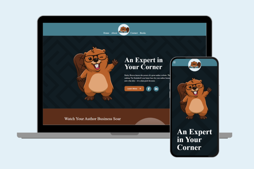
You don’t necessarily have to design your website to be completely “mobile-first,” meaning you don’t have to exclusively build your website using your platform’s mobile view builder. It’s much easier and thus recommended to build your website using your builder’s desktop view.
But that doesn’t mean you should just ignore the mobile version that’s available to check on and maintain as needed. Most website building platforms will automatically generate a mobile-friendly version of your site, but it may not always get everything exactly right.
As you build your site, you should consistently check on the mobile version and ask:
- Does this layout still work on a smaller screen?
- Are images resizing properly?
- Is the text still easy to read?
- Are the buttons easily accessible?
To that end, some great practical tips to keep in mind while building your author website are:
- Preview your site in mobile view frequently
- Keep paragraphs short and scannable
- Avoid cluttered layouts with too many columns
- Use clear headings and adequate spacing between elements
- Stick to simple, intuitive navigation
You don’t need to design exclusively for mobile, nor be a design expert to get it right. Often, what’s good for your mobile site is also good for your desktop version. So keep an eye on how your choices translate between the two.
Want to know how to choose the right website builder platform for you? Learn more here.
Test Your Website Like a Reader Would
One of the most effective things you can do to make sure your website and store are optimized as needed is to simply test your site on your own phone.
Open your phone’s browser (or better yet, follow one of your own links from social media, an email, or an ad), and walk through things like a reader:
- Click your navigation links in your header menu
- Browse through your various book pages
- Try adding a product to your cart
- Complete a test checkout to see how things flow
As you go through the above steps, ask yourself:
- Does anything feel slow to load or frustrating to navigate?
- Is anything just flat-out not working as intended?
- Are there moments I have to think too hard about how to move forward?
- Would I actually complete this process, be it reading the whole section, buying a book, or other?
If something feels even slightly annoying to accomplish on your phone, it’s worth revisiting and revising. Small moments of friction can add up fast and create a bad first impression or overall experience.
Mobile Optimization Builds Trust
A polished, mobile-friendly site signals professionalism. Readers might not consciously think, “Wow, this site is well-optimized,” but they will notice when something feels off as they’re exploring your site and store on their phones.
A clean mobile experience communicates:
- You take your work seriously
- Your books are worth investing in
- Your brand is credible
- You care about your readers and their experience
On the flip side, a clunky mobile site can unintentionally undermine even the best experiences outside your site, whether it’s your social media presence, your email outreach, or even your books themselves.
If your goal is to turn casual browsers into loyal readers, mobile optimization isn’t optional—it’s foundational.
Related Questions
How does page speed affect mobile users versus desktop users?
Mobile users are often on slower connections or cellular data, so page speed matters even more. A delay of even a few seconds can lead to higher bounce rates, especially if images or text aren’t optimized for mobile performance. Making sure your site is providing the fastest loading speed possible will help keep mobile users’ attention better.
Should images be different for my mobile site than for my desktop version?
You don’t necessarily have to create different images in terms of content or aspect ratio, but it’s important to keep in mind that large, high-resolution images can slow down mobile load times. Using compressed images and responsive formats ensures your images will look great in any location without hurting overall loading or performance of your site.
What is “thumb-friendly” design for a mobile device?
Most mobile device users scroll and tap their screens using their thumbs (often just one thumb when navigating a website or social media). Design that’s “thumb-friendly” means making buttons, menus, and links easy to tap, particularly near the center or lower part of the screen. Poor placement of these elements or tiny tap targets can frustrate users, so it’s important to take these into consideration when building your website.
