
The Style section inside the Website Builder lets you set universal design choices for your website. Changes you make here automatically apply across all pages, ensuring your site has a consistent look and feel.
To access the Style tool, open the Page Builder from your dashboard menu, then select the project you want to edit. Once the template is open, click "Style" in the left-side Builder menu to bring up all the category options that can be adjusted and set. Those are:
- Typography
- Colors
- Buttons
- Social Icons
- Inputs
- Layout
- Header
- Footer
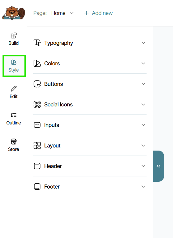
Every new template you edit or from-scratch project you create will have some pre-set Styles already in place, all of which can be adjusted, renamed, or deleted. You can also add more pre-set Style options, such as additional typographies, colors, buttons, and more.
Typography
Typography controls the text styles used throughout your site. Here, you'll set default fonts types, sizes, and colors, and other settings for all the various types of Rich Text Elements used across your site.
Every project or template has the same five pre-built typographies already included and labeled based on suggested use-case for each:
- Hero Title: This can be considered "Heading 1" text, meaning you should only ever apply one per page of your website. It should be used as a clear indicator of the main purpose of that specific page, and will often be what appears as that page's title in search results.
- Section Title: These typographies can be considered as "Heading 2" text, and should be used to label the individual sections on a page. You can use multiples of these titles per page.
- Subtitle: Can be considered as "Heading 3" text, and should be used in tandem with Hero or Section titles. You can also use multiples of these titles per page.
- Specialty Text: A typography often used for standout piece of text that isn't a title or subtitle, such as a specific line in a paragraph or to overlay on top of images.
- Paragraph: The text that should be used for the longer paragraphs within sections of your website. This text is also often used on buttons, within newsletter and contact forms, and for links. When you copy/paste text into your website, you should always remove its formatting, which will default it to paragraph text.
- Link: If you would like linked text to be different from your default paragraph text, you can change it here.
If you would like to create additional Typography Styles that you can quickly and easily add across your site, just click "Add new."
When editing text directly anywhere on your site, you can also override that piece of text's style settings (such as font size or color) and still have it retain its affiliation with the original typography style. That way if you change one of your typography's, it will still apply to that piece of text (while still keeping the settings you manually overrode).
Colors
Colors set the main colors used across your site for elements like headers and footers, section backgrounds, and buttons. Options include:
- Primary: Main brand color, great to use for main section backgrounds, headers, and footers
- Secondary: Complementary color often used for highlights or as an additional background color to give sections variety
- Accent: Can also be used for highlights, section backgrounds, or for buttons, social icons or for text emphasis
- Light: Most often applied to text that needs to appear against a dark-colored background. Can also be used for general background color. Will usually be shades of white, off-white, or light gray.
- Dark: Most often applied to text that needs to appear against a light-colored background. Will usually be shades of black, dark gray, or dark blue.
Every pre-built template comes with the colors (as well as other Style settings) already set according to the design of the template. You are encouraged to replace these colors with your own branding colors or colors from your book cover, but be sure to check through the entire site as you do to make sure everything remains cohesive.
You also have the ability to add more colors to your Style palette, but we recommend limiting your palette to five already included to help maintain a cohesive look that isn't disjointed or overwhelming.
Buttons
The Buttons option controls the style of various types of buttons across your site. Most templates will only include a single "Primary Button" already created, but some will have an additional variant or "Secondary Button" if the design required it.
While you can't adjust a button's overall size (because it will automatically resize itself to fit the amount of text inside it), you can adjust other settings such as font type and size, button color, text color, border color and thickness, or border radius, which will give the button rounded edges. You can also select whether you would like any special effect to occur with the button when a visitor hovers over it.
In many cases, a single primary button will suffice, but if you assign it a Style color that clashes with or disappears against the background behind it, you may need to create a Secondary button to use. To do so, just click "Add new."
Social Icons
Also referred to as Social Media Buttons, this Style setting works similarly to Button Styles. All social icons will default to be more square or rounded than regular buttons, because they don't include any text--only a social media icon. But you can adjust its border radius to make it round or square, as well as change its colors, border, or hover effects.
When adding Social Media Buttons to your website, it's important to remember to set up where they link to in your "Discoverability" menu option first. This is where you'll set the specific links that each Icon should click through to, so that every time you place a Social Icon, you don't have to input the same platform link over again. But remember, even though you can adjust the style of your Social Media Buttons under this Style setting, you won't be able to place any Social Media Buttons on your website at all unless you set at least one up under Discoverability first.
To learn how to set up your associated social media links in Discoverability, visit this page.
Inputs
Inputs control the appearance of input fields on your site, which are the fillable fields inside things like contact forms or newsletter forms. Like buttons, you can't adjust their overall size from within Style settings, but you can adjust their background color, opacity, font type, size, and color, border radius, and more.
And again, wherever you use inputs, just be sure that they don't clash with or disappear into the background color behind them. If they do, we suggest creating an additional secondary input Style to use as needed.
Layout
Layout refers solely to the base background color that will always be present behind ever Section Background element of your website. This is meant to be a color that your website page can default to showing when you don't set a specific background color for a section or a page, or that will appear in the background of automated pages, like product or checkout pages.
It's recommended to set your Layout color to one of your main Color style settings to keep every page of your website looking cohesive.
Header & Footer
Your Header and Footer operate as two independent Style settings, but they function in similar ways. You can access each of them from the Style menu, or by clicking into either one within the viewer to bring up its edit options.
Headers and Footers live under Style settings because they are universal across every page of your website. They serve as recognizable anchors for your site, meaning you don't want them to appear differently from page to page and potentially confuse visitors. So while your Header and Footer themselves can have different styles between the two, you want them to remain consistent across each page.
Each one has preset layouts to choose from that most often adjust the placement of your author logo or name to appear either in the top center or off to the left side. You can also adjust things like colors, size, text, and toggle on or off what items you'd like to appear inside each, such as social media buttons, navigation menu items, and "utilities" like an additional button or cart icon.
Under your Footer settings only, you'll also find "Copyright Bar" settings. These will allow you to adjust the copyright date and name for your website that appears in the lower left corner, as well as links to your Cookies Policy page, Privacy Policy page, and Terms and Conditions page. Be sure to edit each of these pages to contain the content your website and publishing business needs, as each one is a blank template.
To change what appears in your Header's navigation menu, you'll visit the "Settings" section of your website, rather than making adjustments within the Header's Style settings. When in the builder, click "Settings" in the lower left corner. Then click "Menus," and make adjustments as needed.
It's important to note that Style settings apply on a per-project basis, not wide across every project inside your Bookshelf account. So if you decide to design a new website, you will need to set its own unique Style settings. If you'd like to experiment with adjusting Style settings for your live website without actually making those changes live, it can be a great idea to first duplicate your current website as a new project, then do your experiments in that duplicated version. Then once you have your changes ready, you can switch to publish that duplicated site to be your live version instead.